This article describes some of the technical and design problems I ran into while making a map of employment sectors across the UK.
Finding employment data
The end goal of the project was to get a more accurate idea of what industries are more prevalent in a particular region.
I didn’t have a preference to use either turnover or employment as a measurement of industry size. It was easy to find employment data, so I went with that.
To get started I used a dataset from the Office for National Statistics (ONS), containing a breakdown of “Enterprise/local units by 2 Digit SIC, Employment size band and Region”.
For statistical purposes UK businesses are grouped by SIC codes. SIC stands for Standard Industrial Classification of Economic Activities.
For example, the 2 digit SIC code 86 comprises “Human health” and the 3 digit SIC code 861 represents “Hospital activities”. Both codes are part of Section Q, “Human health and social work activities”.
The dataset gave me a breakdown of firms by 2 digit SIC code and UK region (e.g. “South East”).
Unfortunately, this dataset had one big downside: it showed the number of businesses, not how many people work in that industry. I could only guess that number based on the employment size band information in the dataset. For example, if the number of employees was in the 20-49 range I counted that as 35 employees.
That allowed me to start mapping some data, but I couldn’t use it to make any reliable claims. Looking further, I eventually found an Excel file with Employment numbers for each region and sector. (Employment includes part-time and full-time employees, as well as working business owners.)
Still, this data was from 2010. I emailed the ONS to ask if there’s a newer version of that spreadsheet, but the link they replied with didn’t include a regional breakdown.
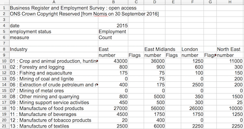
Eventually I read an ONS article that mentioned that you can get detailed data from Nomis, an ONS service for labor market statistics. I used the query form to get the data I needed from the “Business Register and Employment Survey” data.
The new data didn’t include Northern Ireland, so the final map still uses 2010 data for it.
For each of the three datasets I had to write a Node script to convert one or more CSV files into a JSON file. In retrospect, I could have saved some time by picking a better dataset upfront.
It also turned out that the customized Nomis data download was by far the most convenient to work with, since I could configure it to only include the information I was interested in.
Finding a regional map of the UK
Martin Chorley has a Github repository that contains UK map data. Finding the correct files in the repo was difficult, as it wasn’t clear what each file contained. Github can only display GeoJSON files, but not the more compact TopoJSON that’s used in the repository.
Because of that I used the demo website to select and download the map data I needed.
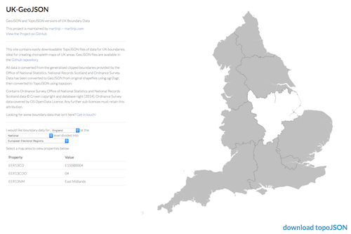
Instead of a single TopoJSON file for the UK I had to download one file each for England, Wales, Scotland and Northern Ireland. To avoid requiring 4 separate requests on page load they needed to be merged into one file.
Also, the TopoJSON for Northern Ireland was split into different electoral wards which needed to be merged into a single region. I ultimately ended up manually calling topojson.mesh in the Chrome console and copy-pasting GeoJSON into an online TopoJSON converter.
I used this topojson command to merge the separate map files:
// Note: make sure that the object names are unique, e.g. not all called "eer"
// I did that by manually changing the names in the TopoJSON files
topojson -p -o uk.json -- scotland.json wales.json england.json northern-ireland.json
And then simplified the map data to reduce its file size:
topojson -p -o uk-simplified.json --simplify-proportion .10 -- uk.jsonOne downside of stitching the map together from different source files was that I couldn’t render interior boundaries on my map, since the regions didn’t share the exact same map boundary points.
Maybe spending more time looking for files in the Github repo could have saved me some of the effort involved in preparing the files for use.
UI Design
The design came about as a combination of paper sketches and a lot of trial and error.

Table Data
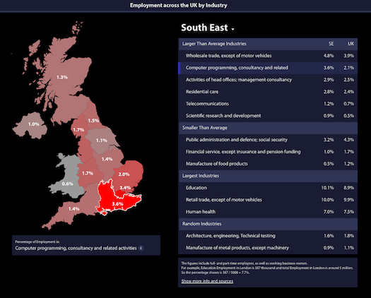
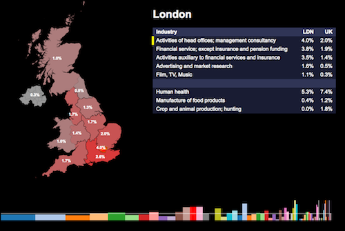
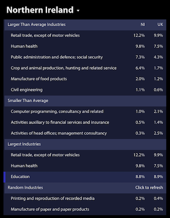
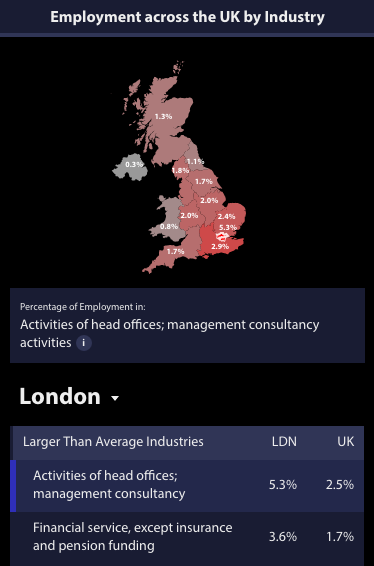
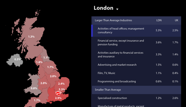
Looking at the largest industries for each region is incredibly boring. You’ll always see education, retail, health, and food/beverage service as the largest sectors.
To avoid that, I compared the regional employment percentage to the UK average and showed the industries with the starkest differences.
Originally I also had a bar at the bottom of the page where the entire width would represent 100% of employment. The height of each column indicated the size of the industry relative to the whole of the UK.
This visualization made it clear that the industries that were shown in the table weren’t necessarily the most important ones. It also made it possible to select many more industries than were shown in the table.
However, the bar didn’t quite fit into the design, and small sectors were difficult to click on. For these reasons I ultimately removed the bar from the page.
To substitute for the information provided by the stacked bar I added a list of the largest regional industries to the table.
In order to continue allowing serendipitous discoveries I also added a section with random industries.
Designing with screenshots in mind
One design goal was to make it easy to create re-usable maps for a particular industry.
Primarily, that meant showing the industry name below the map, so screenshots wouldn’t need further explanation.
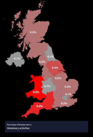
I also made it possible to deselect a region. While this is slightly confusing when interacting with the map, it removes the region outline, resulting in a cleaner-looking screenshot.
Mobile
Moving the table below the map makes it harder to explore the data. You need to scroll up to look at the map after selecting an industry, and then back down again.
So, in portrait mode, I made the map as small as possible to reduce the amount of scrolling required.
The landscape view uses the same two-column layout as on desktop, to avoid the scrolling UX issue.
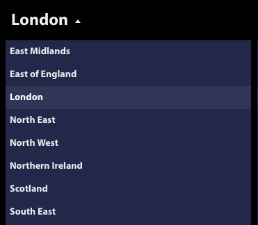
Since it’s hard to select a small region on the map, particularly London, I had to add a dropdown to make the interaction easy on mobile.
A native dropdown wouldn’t have fit into the design, so I used Select2 to be able to customize the CSS.
Code
I spent around 40h on the project in total, so I really prioritized speed of development over maintainability.
As this was a side project, there was also a risk that I’d give up after 10 or 20 hours. It was important to get some kind of result quickly, even if that meant the work would take a bit longer than it otherwise would have.
Views
The JavaScript code is very old-fashioned. For example, I’m building the HTML by slowly concatenating strings:
html += "<div style='overflow: hidden;' class='region-title'>"
    html += "<select class='region-dropdown'>"
        regions.sort().forEach(function(r){
            html += "<option " + (r==region ? "selected" :"") + ">" + r + "</option>"
        })
    html += "</select>"
html += "</div>"
One downside of doing it this way is that I can only replace the full table at once, making transitions difficult. It is also less performant, but I didn’t find the impact to be meaningful.
I considered using ES 2015 template strings, but the site had to work in iOS Safari, and I setting up Babel seemed like too much effort.
Application state
I used a Backbone model to manage the application state. The app has an appState object that looks like this:
{
    "randomSectors": [
        "Repair and installation of machinery and equipment",
        "Security and investigation activities"
    ],
    "selectedRegion": "South East",
    "selectedSector": "Education",
    "previewRegion": null,
    "previewedSector": null
}
Different parts of the app then listen to changes on a particular property:
appState.on("change:selectedRegion")I really enjoyed working with Backbone models again! Recently, I’ve been using either React component state or Redux, but for many projects a global state object with change listeners is so much easier!
Try It
If you’re interested in building something similar, take a look at the code on Github.
Otherwise, you can try out the map yourself.
